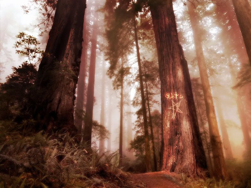
Rate meh plz!!1!!

jd-inflames

Melodic Murderer
Joined
Oct 2, 2003
Messages
6,014
Reaction score
6
Location
My Sanctuary
Website
www.cursedprophets.com
I know it isn't much, but I tried my very hardest!!!


Ok, to make this thread a little more serious, I think I'm finally finished working on my red forest. I've worked on it off and on for the past month, which is sad because it doesn't look like much, but overall time would probably be an hour. Here's the stock and two different versions. I can't think of anything else to do with it, so if you can..be my guest.


Yeah...
 

Arkillo

The best of both worlds
Joined
Jun 9, 2003
Messages
10,653
Reaction score
6
Website
myspace.com
At first I didn't read that the first picutre was stock. And I was amazed. Then I read that it was.

The bottom one's better than the top though.
 

CelestialBadger

Retired Staff
Joined
Feb 18, 2003
Messages
6,792
Reaction score
18
At first I didn't read that the first picutre was stock. And I was amazed.
Same.

At both pictures: The star, pentragram, whatever looks too flat. It doesn't look like it's on the tree at all. I guess it has to do with the values: In the center it looks like the tree dips inward, yet that's not reflected in the star at all. Solve it maybe with dodge/burns...I don't know ps that well.

The bottom one does look better though.
 

jd-inflames

Melodic Murderer
Joined
Oct 2, 2003
Messages
6,014
Reaction score
6
Location
My Sanctuary
Website
www.cursedprophets.com
Yeah, I was having real problems with that star, I was trying the best I could to make it look like an etching or a carving.
 

MacMan

BattleForums Senior Member
Joined
May 17, 2003
Messages
1,943
Reaction score
1
A displacement map would probably work better. And yeah, I didn't realize the first photo was stock... I thought maybe you had manipulated something and added some totally awesome looking fog to it...
 

CelestialBadger

Retired Staff
Joined
Feb 18, 2003
Messages
6,792
Reaction score
18
I thought it was a render at first.
 

MacMan

BattleForums Senior Member
Joined
May 17, 2003
Messages
1,943
Reaction score
1
Yeah, you would think that, wouldn't you? :yamer
 

jd-inflames

Melodic Murderer
Joined
Oct 2, 2003
Messages
6,014
Reaction score
6
Location
My Sanctuary
Website
www.cursedprophets.com
Look at the differences fog wise between the stock and what I did. Before I made the red haze, I did create my own fog, which turned out rather well if I do say so myself.
 

MacMan

BattleForums Senior Member
Joined
May 17, 2003
Messages
1,943
Reaction score
1
That was fun ;)
Paste this on top of your image and set it's layer style to "Difference." (Two duplicate images yield a difference layer of complete black. :D) The next image would be produced by duplicating the picture onto itself, setting the duplicate to some sort of dodge, and then maybe some contrast adjustments. Just guessing.

I did a really quick analysis of your image, and the only fog that caught my eye was some minor perturbations in the lower right corner. It's hard to see how well your fog turned out when you can barely distinguish it from the stock (;)).
 

Ntrik_

Premium Member
Joined
Jan 19, 2004
Messages
9,687
Reaction score
4
Anatomy Of Vice said:
At first I didn't read that the first picutre was stock. And I was amazed. Then I read that it was.

The bottom one's better than the top though.
yea >< but JD, if you add in bit of brushings here and there, you could make forest fire like that :)
 

BooDha

Member!
Joined
Jul 31, 2005
Messages
137
Reaction score
0
Location
Palmdale
So what did you basically do? change the color, added the star, duplicated, Gaussian Blur, and overlay or screen? Its something simple but at least its something, not bad.
 

FuLouZero

BattleForums Senior Member
Joined
Jul 5, 2003
Messages
1,341
Reaction score
0
I looked at the green forest and I was amazed untill I read that it was a stock. I thought it was a render or a nice photograph by you :|

Just my opinion go for a more of a orange color and intense the lightign. Red is just a pain to the eyes.
Note I didn't use any brushes besides fethered erasers so it could look alot better. Also maybe some arcane text might flavor it up some ;)
 

BooDha

Member!
Joined
Jul 31, 2005
Messages
137
Reaction score
0
Location
Palmdale
Cool the star actually looks carved in, and cool addition to the top carving above the star.
 

NewPosts

New threads

Top