Jason
BattleForums Guru
- Joined
- May 10, 2003
- Messages
- 11,073
- Reaction score
- 2
I figure instead of making 500000 posts in the screenshot thread we could have UI screenies go here.
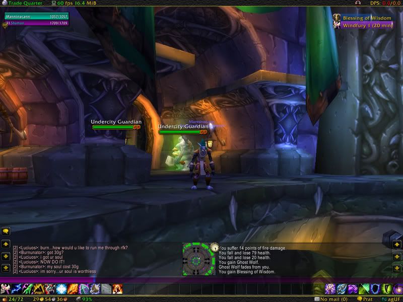
I am always tweaking my UI. I can't stop it's an addiction. I was on a perilous search for a UI style for myself that both looked nice and was fully functional for my playstyle.
On the official WoW forums in the UI and Macro forum they have a post your UI screenshot thread. One person in particular has a UI setup that everyone loves.
This is the first setup he did:

This is the second setup he did:

I decided I loved his second setup. I downloaded his UI that he posted for everyone, and to my surprise his settings here all weird in the WTF folder. Not only was nothing set into place, but his second UI setup was not even in the DART/DUF profiles.
His first setup (as I've posted) was, though, but it was all cluster****ed as well. I spent literally 4 or more hours trying to convert his first UI setup into his second UI setup using DART/DUF and I was eventually able to replicate it. Then, once I did such I modified it a little to my own tastes. (Mostly took out player/pet/ToT unit frames and replaced them with my HUD, and tweaked the action bar setup/art.)
So, after all that time, I hope to god I can bring myself to stick with this setup. I love it a whole lot..it's very nice imo.
Note: Casting bar is above pet bar, and party frames/art are obviously set as well just can't see them.
(w/o target)

(w/ target)

Note: I just noticed that I need to make a DART frame for the SWStats box, and also that my action bars are in one box instead of one box per bar like his setup. I will probably change this. Also, I have no idea how he got his pet bar to scale so well with everything because I couldn't for the life of me. That's why mine is where it's at. Also, FuXPFu is being buggy and won't load. This UI is still in beta phase for me essentially, but it's looking quite nice so far imo.
I am always tweaking my UI. I can't stop it's an addiction. I was on a perilous search for a UI style for myself that both looked nice and was fully functional for my playstyle.
On the official WoW forums in the UI and Macro forum they have a post your UI screenshot thread. One person in particular has a UI setup that everyone loves.
This is the first setup he did:

This is the second setup he did:

I decided I loved his second setup. I downloaded his UI that he posted for everyone, and to my surprise his settings here all weird in the WTF folder. Not only was nothing set into place, but his second UI setup was not even in the DART/DUF profiles.
His first setup (as I've posted) was, though, but it was all cluster****ed as well. I spent literally 4 or more hours trying to convert his first UI setup into his second UI setup using DART/DUF and I was eventually able to replicate it. Then, once I did such I modified it a little to my own tastes. (Mostly took out player/pet/ToT unit frames and replaced them with my HUD, and tweaked the action bar setup/art.)
So, after all that time, I hope to god I can bring myself to stick with this setup. I love it a whole lot..it's very nice imo.
Note: Casting bar is above pet bar, and party frames/art are obviously set as well just can't see them.
(w/o target)

(w/ target)

Note: I just noticed that I need to make a DART frame for the SWStats box, and also that my action bars are in one box instead of one box per bar like his setup. I will probably change this. Also, I have no idea how he got his pet bar to scale so well with everything because I couldn't for the life of me. That's why mine is where it's at. Also, FuXPFu is being buggy and won't load. This UI is still in beta phase for me essentially, but it's looking quite nice so far imo.


